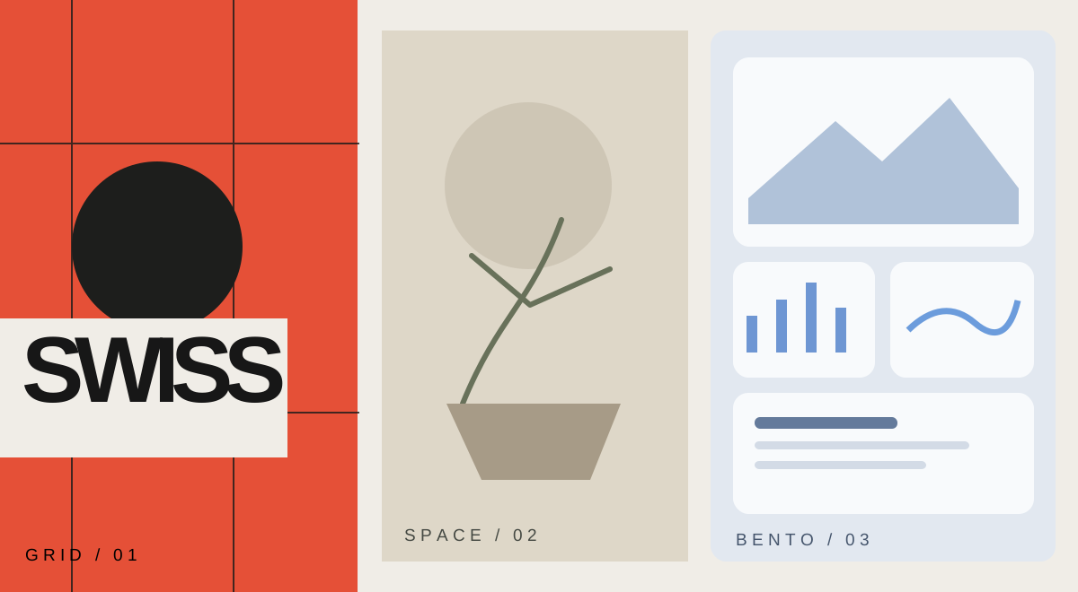
Design styles have names: from Swiss Style to Bento Grid.
A practical guide separating design movements, interface patterns and CSS tools—from Swiss typography to modern SaaS cards.
 RESEARCH NOTE
01
Separate design language from tools.
Clearer names make comparisons possible.
Words like minimal or Nordic can describe an atmosphere, not necessarily a layout rule. I find it more useful to separate philosophy, visual style, layout pattern and design system.
A design movement, a visual style, an interface pattern and a design system answer different questions.
- POINT
- A design movement, a visual style, an interface pattern and a design system answer different questions.
02
Swiss Style puts information first.
Clarity before ornament.
What stands out to me in Swiss Style is the grid, asymmetric composition, sans-serif typography and hierarchy. It is more than a black-and-white layout with empty space.
Structured does not mean symmetrical.
- POINT
- Structured does not mean symmetrical.
03
From Bauhaus to Japanese and Nordic minimalism.
The differences matter.
Bauhaus emphasizes function and geometry. Japanese minimalism favors space and restraint; Scandinavian design leans into warmth and usability. Editorial design guides readers with typography and photographs.
Neo-Brutalism uses heavy borders and contrast; contemporary luxury relies on restraint and detail.
- POINT
- Neo-Brutalism uses heavy borders and contrast; contemporary luxury relies on restraint and detail.
04
Bento is a layout, not a movement.
Know what cards are for.
Bento Grid groups features and previews in cards of varied sizes. It is a layout pattern, not a historical school. It can explain a product well, but an operational dashboard does not need to turn every action into a huge card.
Linear-like fine dividers and dense interface patterns are useful references, not rules to copy wholesale.
- POINT
- Linear-like fine dividers and dense interface patterns are useful references, not rules to copy wholesale.
05
CSS tools don't choose the aesthetic.
Tools are not aesthetics.
CSS Grid and Flexbox handle layout. Tailwind provides utilities; Bootstrap offers ready components; CSS Modules scope styles; Sass helps organize them. None can choose a visual philosophy for us.
shadcn/ui offers editable component code; Radix and React Aria support accessible behavior; Motion can handle transitions.
- POINT
- shadcn/ui offers editable component code; Radix and React Aria support accessible behavior; Motion can handle transitions.
06
Choose for context, not fashion.
Begin with use.
For long-form reading I prioritize measure, type scale and white space. Bento suits feature showcases; dense workspaces need clear tables and navigation. I would rather start with the task than a fashionable name.
Combining every popular radius, glass surface, shadow and font rarely produces clarity.
- POINT
- Combining every popular radius, glass surface, shadow and font rarely produces clarity.
GRID.Clarity · hierarchy
余白Space · calm